Case Study | Enterprise UX, Design Systems, and Platform Modernization
Enterprise Design Systems
End-to-end design system work focused on modernizing legacy enterprise products, establishing scalable UI and UX foundations, and creating clear handoff processes that enable teams to ship consistently at scale.
Work includes regulated environments such as the Federal Reserve and multi-brand DTC insurance platforms; due to confidentiality, this case study uses this site to demonstrate system architecture, process, and implementation at a high level.
Explore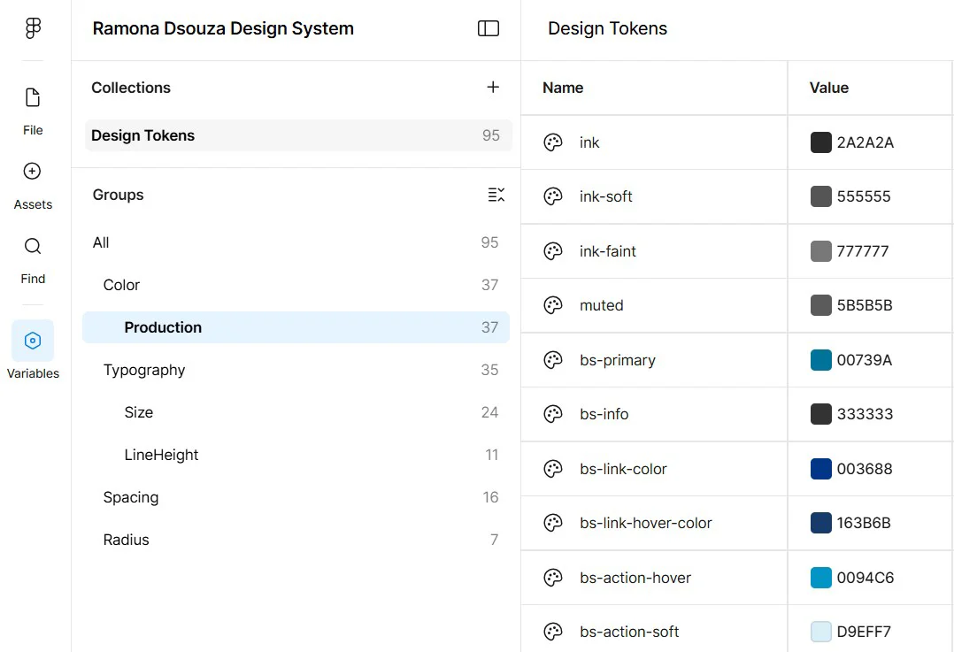
Process | At a glance
Design systems as infrastructure, using this site as the example.
In enterprise environments, inconsistency is expensive. This work treats the design system as foundational infrastructure, using this site to illustrate how UX consistency, accessibility, and development efficiency are unified into a single, scalable source of truth.
High Level Overview
Scope of work and responsibilities
Legacy UI modernization
Audited existing enterprise interfaces to identify visual drift, outdated interaction patterns, accessibility gaps, and inconsistent layout logic. Modernized these systems incrementally to avoid disruption while steadily improving usability and cohesion.
Foundational system design
Defined core foundations including typography scales, spacing systems, color tokens, elevation rules, and responsive breakpoints that scale across desktop and mobile.
Component architecture
Design once, reuse everywhere
Core components
Designed and documented reusable components such as buttons, form elements, navigation patterns, tables, and modals with clear states, variants, and usage guidelines.
Responsive patterns
Ensured components adapt predictably across screen sizes, supporting mobile-first use cases without compromising dense enterprise desktop workflows.
Accessibility by default
Embedded accessibility considerations into component design, including contrast, focus states, keyboard navigation, and assistive technology compatibility.
Design to development
Clear handoff, fewer surprises
A design system only works if engineering teams can implement it confidently. This work emphasized clarity, documentation, and shared language between design and development.
Specs and annotations
Delivered detailed component specs including spacing, behavior rules, edge cases, and responsive behavior to eliminate guesswork during implementation.
Design tokens
Worked with developers to align visual decisions with tokenized values that translate cleanly into code and support long-term theming and maintenance.
Ongoing collaboration
Maintained tight feedback loops with engineering to refine components based on real implementation constraints rather than theoretical designs.
Training and enablement
Mobile design fundamentals
Created structured learning tracks to teach interns how to design mobile experiences that respect constraints, prioritize content, and scale within enterprise systems.
Competitor research programs
Guided teams through competitive analysis exercises to understand industry patterns, usability expectations, and opportunities for differentiation.
Page layout ideation
Led workshops and exercises focused on layout exploration, information hierarchy, and content prioritization within real product constraints.
Impact - What organizations gain
Faster delivery
Teams ship faster with fewer design and engineering cycles because decisions are centralized and reusable.
Consistency
Users experience coherent interfaces across products, reducing learning curves and support burden.
Scalable teams
New designers, interns, and engineers onboard faster with shared patterns, documentation, and training.
Disclosure
This case study represents work in enterprise and regulated environments, where design systems balance flexibility, governance, and long-term maintainability. Due to confidentiality, detailed implementations, internal documentation, and before-and-after comparisons are shared in interviews, along with validated performance outcomes, including cases where redesigned experiences directly contributed to tripled profits.